Anneli Torres portfolioSpecialist practice
Data Visualization Designer
Anneli determines which evidence an executive audience needs first, then structures the chart, headline and supporting detail around that decision. Her work includes financial exhibits, executive dashboards, publication graphics and accessible visualization systems—not charts created in isolation.
Complete portfolio
This specialty is one part of a 20+ year practice.
This page focuses on financial exhibits, executive dashboards and accessible data visualization. The main portfolio brings together Anneli’s complete experience, case studies, founder-led products, services and work across financial services, government, education, NGOs and international initiatives.
The audience question comes first
The audience question comes first
Before selecting a chart, Anneli defines who will use the information, what they need to compare, and which decision the evidence must support. That question determines the hierarchy, chart form, annotation, level of detail and narrative order.
Financial exhibits and executive dashboards
Financial exhibits and executive dashboards
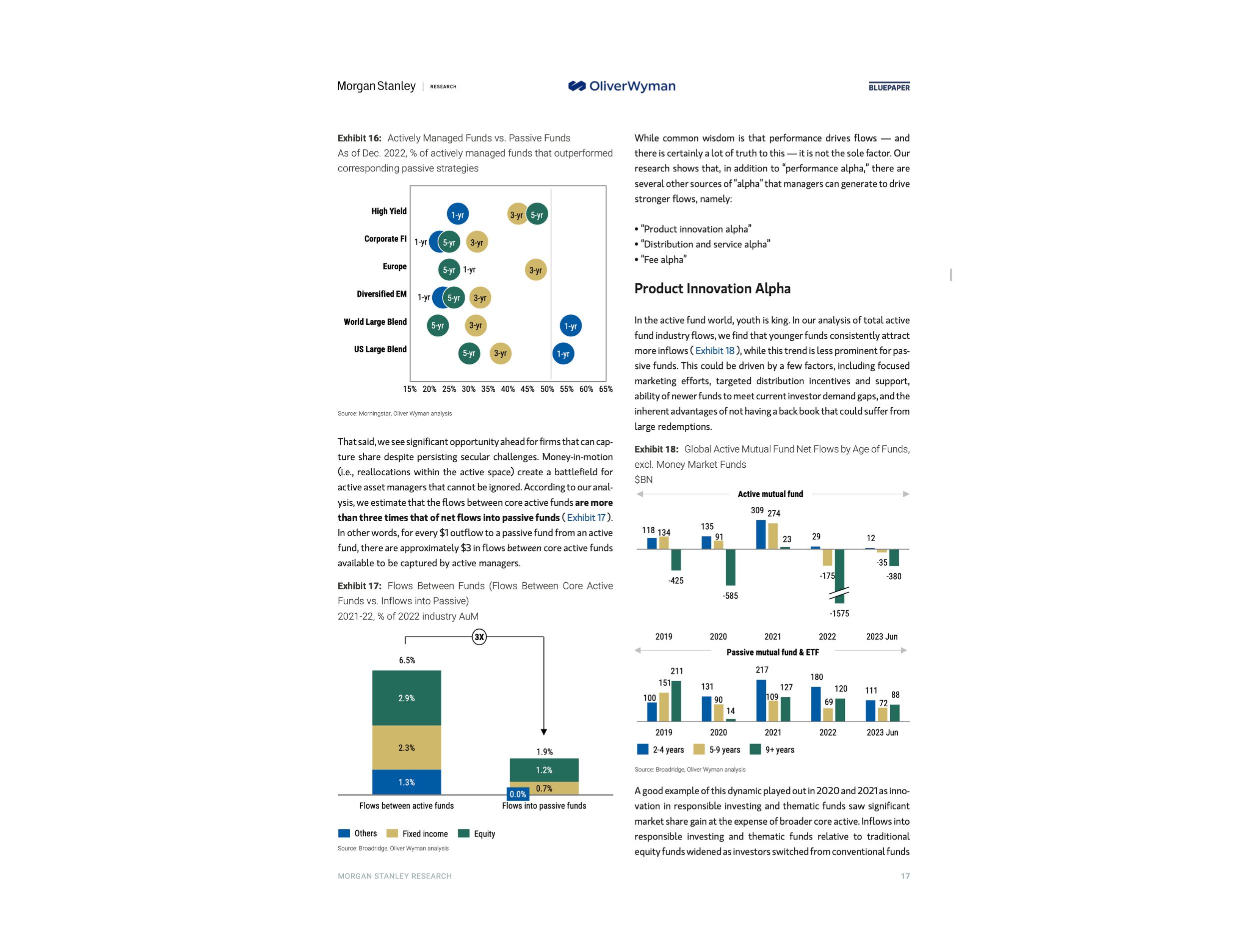
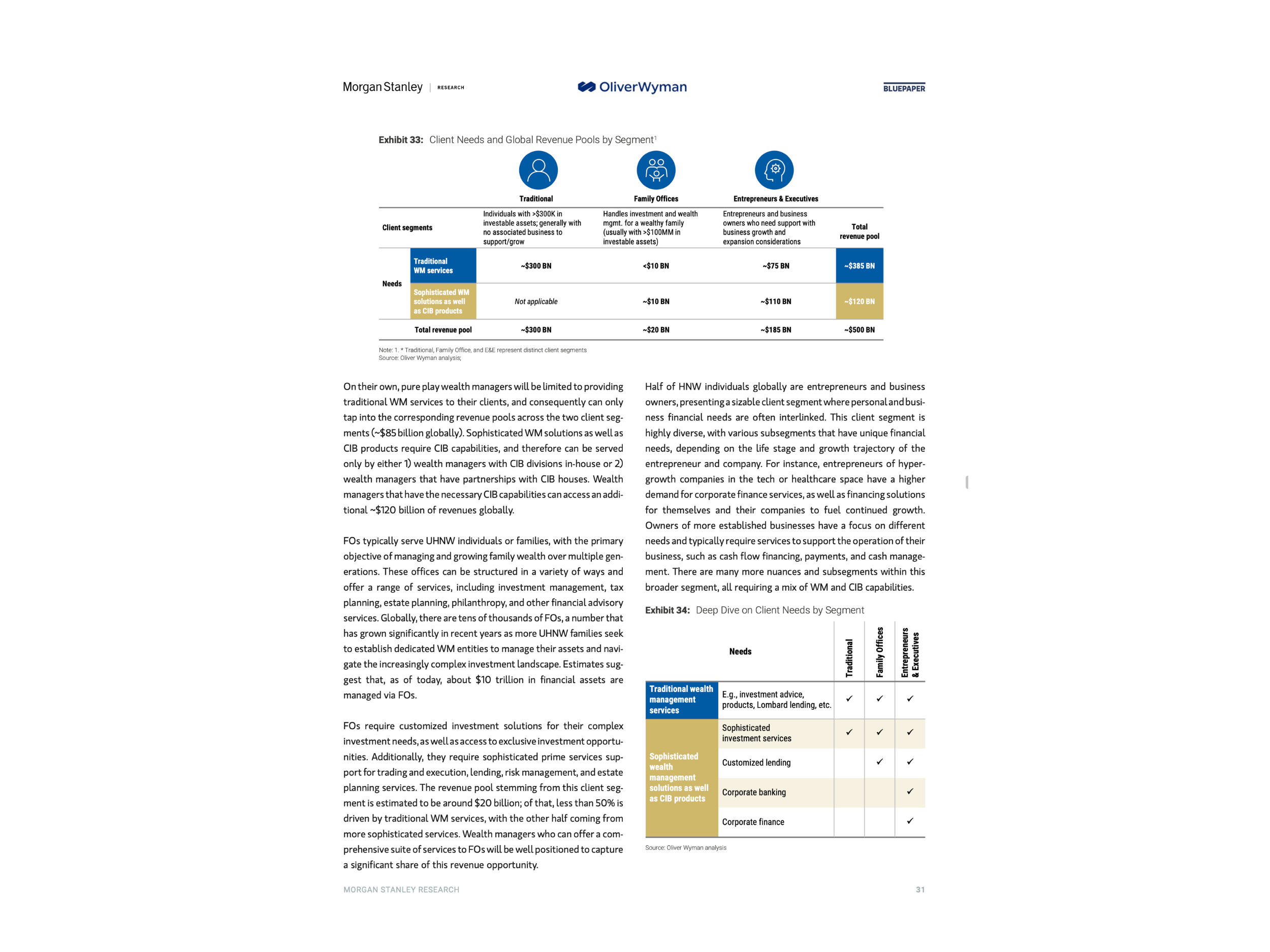
Her work includes comparison, change over time, distribution, composition, relationship and process views across presentations, reports and browser-based dashboards. Headlines state the conclusion; scales, labels and annotations make the evidence inspectable.
Selected visual evidence
See the work behind the specialty
The evidence below comes from published financial work. Each exhibit belongs to a larger narrative and uses a repeatable visual grammar rather than one-off styling.
Accessible visual evidence
Accessible visual evidence
Color is never the only carrier of meaning. Contrast, direct labeling, pattern, shape, reading order, alternative text and a meaningful text equivalent are considered according to the delivery format and audience.
Visualization systems and handoff
Visualization systems and handoff
Anneli documents chart grammar, color logic, typography, templates, reusable components and quality checks so teams can produce new exhibits without visual drift. Handoff can include editable source files, training, governance and accessible-output guidance.
Selected evidence
Verified experience and outcomes
Tools and working methods
Production fluency
Related practice
Work connected to this specialty
Contact