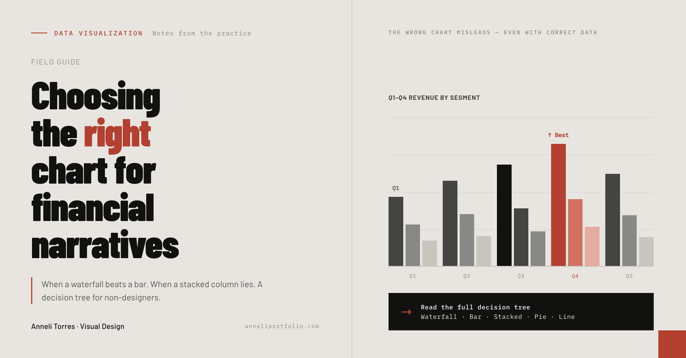
Choosing the Right Chart for Financial Narratives
In financial reporting, the wrong chart doesn't just look bad. It can misrepresent data, mislead a reader, or undermine the credibility of an analysis. I've designed data exhibits for Morgan Stanley industry reports, LNG sector white papers, government statistical publications, and executive dashboards. The chart selection decisions in those contexts carried real consequences.
This is a decision-making framework for non-designers who need to communicate financial data clearly, and for designers who want to understand the logic behind chart type selection in regulated or high-stakes communication.
The fundamental question: what is this chart supposed to do?
Before selecting a chart type, answer one question: What is the single thing I want the reader to understand from this chart?
If you can't answer that in one sentence, you don't yet have a chart problem — you have a narrative problem. Solve the narrative first.
Financial charts typically serve one of five purposes:
- Comparison — How does X compare to Y at the same point in time?
- Trend — How does X change over time?
- Composition — What parts make up the whole?
- Distribution — How is X spread across a range?
- Relationship — How does X correlate with Y?
The chart type follows from the purpose.
When the waterfall beats the bar
Bar charts show comparison. Waterfall charts show change — specifically, how a starting value arrives at an ending value through a series of positive and negative contributions.
In financial narratives, waterfalls are the correct choice when you need to explain:
- How revenue moved from one period to another (organic growth, acquisitions, FX impact, disposals)
- How operating costs broke down against a budget
- How a fund's NAV changed across contribution factors
A bar chart showing the same data forces the reader to do the arithmetic themselves. The waterfall does it visually.
Common mistake: Using a waterfall for data that is not cumulative. If your series doesn't have a logical "this is what produced that" relationship, use a bar chart. A waterfall without cumulative logic confuses more than it clarifies.
Tools I rely on for waterfall charts: Think-Cell (for PowerPoint) is the most robust option for financial-grade waterfalls with automatic connector lines, floating bars, and label precision. Datawrapper handles web-published versions cleanly.
When a stacked column lies
Stacked column charts show composition over time — how the parts of a whole change across periods. They are common in financial reporting and commonly misread.
The problem: only the bottom segment of a stacked column is anchored to the zero baseline. Every segment above it floats. Readers instinctively compare the tops of colored bands as if they were independent bars — but those tops are cumulative values, not segment values. Changes in a middle segment are nearly impossible to read accurately.
When stacked columns are appropriate:
- When the total is as important as the parts
- When the number of segments is small (ideally three or fewer)
- When the reader needs to understand trend in the total, not precision in individual segments
When to use instead:
- 100% stacked columns — when proportion matters more than absolute value
- Small multiple bars — when individual segment trends matter and must be read accurately
- Line charts per segment — when tracking individual components over time is the primary need
A case from practice: When producing exhibits for the Morgan Stanley AI Tipping Point report, the data often showed multi-factor breakdowns over time. Rather than defaulting to stacked columns, I evaluated each exhibit individually. Where total trends were the headline, I used stacked columns and labeled the total explicitly. Where segment performance was the story, I separated segments into adjacent grouped bars. The distinction changed the interpretive accuracy of the reader significantly.
The line chart: overused and under-considered
Line charts are appropriate for continuous data over time — stock prices, interest rates, economic indicators. They imply continuity between data points: that the value moved smoothly from one point to the next.
When line charts mislead:
- Connecting discrete categorical data (regions, products, departments) with a line implies a continuous relationship that doesn't exist
- Truncated y-axes that start above zero dramatically exaggerate variance in lines that actually move within a narrow range
- Too many series on a single line chart (more than four or five) produce a "spaghetti chart" that is visually unreadable
Best practice for financial line charts: Always start the y-axis at zero unless there is an explicit editorial reason not to, and if you don't, label the truncation visibly. Label the terminal value of each line directly rather than relying on a legend — readers should not need to look away from a line to identify it.
Pie charts: when to use them and when to never use them
The rule most data visualization practitioners agree on: pie charts are appropriate only when showing part-to-whole relationships with two or three segments, and only when the precise value of each segment matters less than its rough proportion.
For financial narratives specifically, pie charts are almost always the wrong choice because:
- Financial readers need to compare values, and human perception of angles and arc lengths is inaccurate
- More than three segments produce a chart that requires a legend, which requires the reader to look away from the chart
- The data story in financial reporting almost always involves how things changed, not what they looked like at a single frozen moment
Replace pie charts with:
- A single large-number callout for the dominant figure ("68% of revenue from recurring sources")
- A horizontal bar chart (far easier to compare lengths than angles)
- A treemap for hierarchical composition data with many categories
A practical decision tree
``plain What do I want to show? │ ├─ COMPARISON (how X compares to Y, same time period) │ └─ Grouped bar chart (horizontal if many categories) │ ├─ TREND (how X changes over time) │ ├─ Few data points, discrete time → Bar chart │ └─ Many data points, continuous time → Line chart │ ├─ CHANGE (how X arrived at Y through contributions) │ └─ Waterfall chart │ ├─ COMPOSITION (what makes up the whole) │ ├─ At one point in time, 2–3 parts → Pie or donut (with caution) │ ├─ At one point in time, many parts → Treemap or horizontal bar │ └─ Over time → Stacked column (if total matters) or small multiples │ ├─ DISTRIBUTION (how values spread across a range) │ └─ Histogram, box plot, or dot plot │ └─ RELATIONSHIP (how X correlates with Y) └─ Scatter plot ``
Labeling and annotation: the non-designer's most powerful tool
Chart type selection is half the problem. The other half is annotation. In financial narratives, the reader should be able to read the chart's conclusion without the surrounding prose. If the chart requires three paragraphs of explanation to be understood, the chart is not doing its job.
Annotate directly on the chart:
- Label data points, not just axis ticks
- Highlight the specific value that supports your narrative argument
- Use a callout box for the single most important data point
- Write a chart title that states the conclusion, not just the topic ("Q3 revenue 22% above target" rather than "Q3 Revenue")
This is the approach I applied across all 51 data exhibits for the Morgan Stanley report — each exhibit was designed to be interpretable in isolation, because in a financial industry report, readers jump, skim, and circulate individual pages.
Sources and further reading
- Tufte, E.R. — The Visual Display of Quantitative Information (2nd ed.) — Graphics Press (the foundational text)
- Schwabish, J. — Better Data Visualizations — Columbia University Press, 2021
- Cairo, A. — How Charts Lie — W.W. Norton, 2019
- Few, S. — Show Me the Numbers: Designing Tables and Graphs to Enlighten (2nd ed.) — Analytics Press
- Datawrapper Blog — What chart type do I use? — blog.datawrapper.de
- Financial Times Visual Vocabulary — github.com/Financial-Times/chart-doctor
- Flourish — Chart types guide — flourish.studio
Related professional practice
Read the related case study, review presentation, editorial, and accessibility services, or explore Anneli’s complete professional profile.